Pádraig Mac Aodhgáin (Patrick Egan) PhD, currently a Research Data Steward at University College Cork. I am also a scholar specializing in digital humanities, ethnomusicology and metadata. I perform Irish traditional music on concertina, am a researcher of cultural heritage, a developer of digital artefacts, and have presented research at conferences in Ireland, England, Europe, North America, and China.


June 22, 2026An article published in the journal Ethnomusicology Ireland, published in June 2026
Abstract: Seán Ó Riada (1931–1971) was an influential figure in Irish cultural life during the mid-twentieth century. His regular presence on Irish radio station Radio Éireann (RÉ) was a catalyst in his rise to prominence. In this paper, Ó Riada’s first decade of broadcasts on RÉ are considered, both in his role as Assistant Music Director at RÉ, beginning in 1953, and those that he produced and presented after that as an independent contractor for RÉ. This research examines an approach to radio programming at RÉ that emerged gradually from 1955 onwards, culminating in Ó Riada’s influential radio series entitled Our Musical Heritage in 1962. Ó Riada’s activity was influential but also shaped by agendas of the station during the 1950s. Evidence is used from archives and the history of broadcasting to reference key moments and artistic developments in Ó Riada’s shows alongside RÉ’s progressing agenda.
Read the open access article in full here: https://doi.org/10.64208/RHSO5832 [...]

October 19, 2024The timeline above documents Joe Cooley’s life, and has been compiled by Nicola and Paddy Egan, featuring events of note and Joe’s movements throughout the 1950s, the 1960s, and into the 1970s. This timeline contains copyrighted media, and is only intended as a research tool. It is being updated continually as new information is found, and citations of each event are then recorded in notes for verification. This timeline helps to facilitate an understanding of Joe’s life as interviews and evidence-collecting continues, but is not intended as a definitive account of Joe’s life. A lot of work has been carried out by Dr Charlie Piggott on Joe Cooley’s life, and one such narrative from Charlie can be accessed here:
A Question of Comic Wit
Nicola and Paddy are involved in an Arts Council project entitled “The Cooley Connection”, which is an experiment in applied research, to see what happens when a sound installation is used at a festival such as the Cooley-Collins! The Cooley Connection seeks to delve deeper into the world of Joe Cooley (of most interest as Nicola grew up in the San Francisco Bay Area), and in parts, where Kieran Collins and Joe crossed paths. Any information on Joe and Kieran is most welcome as this project progresses.
The Cooley Connection
During the week before the 40th Cooley Collins Trad festival, Paddy Egan and his wife Nicola will perform for kids in local schools, spreading the word about Joe Cooley, Kieran Collins and the Cooley Collins Trad Fest.
On the weekend of the 40th Cooley Collins Trad Festival, Nicola and Paddy Egan will do a sound installation “trail” in several locations around Gort. They have collected 1950s and 1960s objects, and these objects will contain sets of earphones with Mp3 players, so people at the festival can listen to interviews and archival recordings collected by Nicola and Paddy from people who knew Joe Cooley from all over the world.
A playlist in each object will feature stories about Joe’s time in America, the experiences of people who met Joe, his family, and his neighbours that remember him still. More detailed information in the press release below.
Announcing Joe Cooley Digital Sound Installation & Storytelling
Joe Cooley – hurler, block-layer, acrobat, and accordion player extraordinaire
Joe Cooley in America – The Cooley Connection
Summary: In September 2024, an interview piece on RTÉ Céili House launched “The Cooley Connection” project and 40th Cooley/Collins Festival this Bank Holiday weekend in Gort, Galway
Lauded as “first-of-its-kind” by RTÉ Presenter, Kieran Hanrahan, this October bank holiday there will be an innovative new addition to the Cooley/Collins Traditional Irish musical festival.
In tribute to its 40th anniversary year, Dr Pádraig Mac Aodhgáin (concertina) and Nicola Uí Aodhgáin (pipes) have collected interviews, stories and archival recordings about Joe Cooley from around the world.
Over 130 audio clips will be available at 13 locations installed around the square in the market town of Gort as part of “The Cooley Connection” project.
Stories have been contributed by local legends, ordinary people and famous musicians both in Ireland and America – as well as family and neighbours who speak about an Ireland that feels both far away in time, and close in spirit.
Hidden in historical objects and displayed at symbolic locations in cafés, pubs and stores around the town, the digital sound installation has something for everyone: young and old, for newcomers and locals alike – and even for those who prefer hurling over the music.
The goal is that people will encounter the sound installation during the course of the festival weekend so that the stories of the past will surround us and come alive once again.
In so doing, we hope people learn a little about the music and history in Gort and the time of high rural emigration during the 1950s through stories about Joe Cooley.
One typically doesn’t need to introduce Joe Cooley – such is the fame which surrounds this accordion player, who was a founding member of the Tulla Céili Band before leaving to see most towns in America and play for dancers in just about every town in Ireland and England as well.
For those interested in finding more about the background to the project and the history around Joe Cooley’s music, there will be a presentation on Saturday October 26 at 6pm in the Gort Town Hall Theatre.
Visitors to the Gort festival are encouraged to explore the talks, sessions, concerts, dancing and of the annual Cooley Collins Cup – all of which can be found here at the Cooley/Collins website: http://www.cooleycollinstradfest.com/index.php/programme
First set up in 1984 in memory of Kieran Collins, a highly regarded tin whistle player whose untimely passing in 1983 sparked what may well be Ireland’s oldest tribute festival to local musicians. Also recognised is the legendary Joe Cooley, who died in 1973 aged 49 years old. Hence, the Cooley/Collins festival – and long may it continue.
The brochure for The Cooley Connection will be printed and placed in boxes, alongside the Mp3 players and earphones. Here is an example brochure:
Download
Your feedback for the Cooley Connection project is very helpful to us, and can be sent anonymously. Please add your thoughts on the project here: [...]
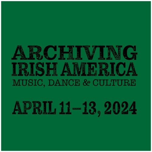
April 11, 2024From Thursday 11th to Saturday 13th April 2024, a conference was brought together at the Ward Irish Music Archives in Wisconsin. The theme of the weekend event was “Archiving Irish America: Music, Dance, and Culture”.
For this meeting, I presented a version of the research that I had conducted on a survey of practitioners of Irish traditional music across North America. The survey sought to understand the musical landscape more broadly, and the thoughts and interactions of practitioners with archival audio. The conference brought together a fascinating set of individuals, culminating in a weekend of engagement on Irish American culture. More on the Ward Irish Music Archives website.
A description of this meeting:
“In Irish America, archives have been essential in allowing recent generations to tap into the long history of music, language, oral traditions, dance and folklore essential to a vibrant and living culture. Archiving Irish America: Music, Dance & Culture will bring together those who engage with archival materials in their research or creative practice, those who have collected and curated cultural treasures for these archives, and those who wish to contribute to documenting and creating Irish American culture through these important institutions.”
As circumstances dictated, I was unable to attend the event in person. However, I was able to record and deliver an mp4 of the work, and a full length presentation of my paper for this conference is now available here: [...]
April 9, 2024In 2019 and 2020, I conducted a survey on the website, SurveyMonkey.com, it involved over 528 practitioners of Irish traditional music across North America. This was the first survey of its kind to focus on this region and collect feedback about their musical lives and engagement with archival audio files. The survey consisted of forty questions, divided into two sections, in the first a look at the musical backgrounds of practitioners, and in the second a focus on their activities with audio and archives in North America and beyond. It was intended to develop a clearer picture of the musical landscape of Irish traditional music in North American, and how practitioners relate to archives.
The following presents a series of digital visualisations of survey data from 528 respondents across North America, using the framework D3.js and with spatial analysis platform, Carto.com.
Age
See the Pen
Age Now by Pádraig Mac Aodhgáin (@rootseire)
on CodePen.
Age Became involved in Irish Traditional Music
See the Pen
Untitled by Pádraig Mac Aodhgáin (@rootseire)
on CodePen.
Do you have experience playing other styles of music/song/dance?
See the Pen
Genres by Pádraig Mac Aodhgáin (@rootseire)
on CodePen.
Familiarity With Collectors In North America
See the Pen
Familiarity by Pádraig Mac Aodhgáin (@rootseire)
on CodePen.
Formative Places in Musical Development
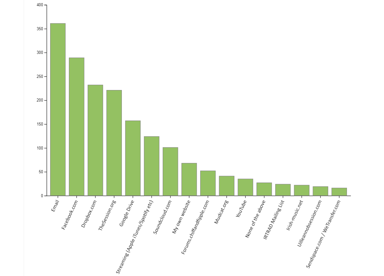
Resources Used To Share Irish Traditional Music
See the Pen
Resources by Pádraig Mac Aodhgáin (@rootseire)
on CodePen.
Devices Used to Listen to Irish Traditional Music
See the Pen
Devices Used by Pádraig Mac Aodhgáin (@rootseire)
on CodePen. [...]

February 1, 2022Patrick Egan (Pádraig Mac Aodhgáin) performing at the Library of Congress in August 2019 alongside local musicians from Washington DC
My research article “In search of the item: Irish traditional music, archived fieldwork and the digital” is now published in Archival Science journal, web version here: https://rdcu.be/cFzl9. Thanks to all at the Library of Congress, the American Folklife Center, Library of Congress Labs, Digital Specialist Matt Miller, and all the Irish Traditional Music Archive.
In this article, I demonstrate the challenges and possibilities for using #LinkedData with archived fieldwork (audio collections) from the American Folklife Center at the Library of Congress.
The project, Connections in Sound, a case study that identified how archived audio metadata of Irish traditional music is important for infrastructure like @ITMADublin’s LITMUS project & Authority Files at @librarycongress & points towards future possibilities when using them.
The team developed datasets, created proof-of-concept RDF Triples using Python to connect non-commercial audio material across AFC collections and then on the WWW, with LITMUS ontology, the Séamus Connolly Collection in Boston & tune ID web scrapes on Irishtune.info.
This experimentation helps to inform possibilities & limitations for digital infrastructures as they evolve -ways of representing a more diverse selection of musical performers in archives & across the Web (especially musicians who perform but who do not record commercially)
Suggestion: enable diversity by using collections such as the AFC’s, musicians recorded by collectors. Add them to resources like Wikidata/Wikipedia so they can be identified & linked to multiple other performances of a certain tune / song / dance (both professional & amateur)
The ideal is a “multiplicity”, see Foley’s “Oral Traditions and the Internet”, “Listening to multiple versions…and programmatically denying priority to any single one – will go a long way toward providing a … sense of the song’s many-sided, irreducible character.”
There are many ways to represent Irish traditional music, and digital infrastructures are evolving, but archived collections of fieldwork that contain a wide variety of material from oral traditions could have a big part to play if considered.
This research was generously supported by the Fulbright Tech Impact Award and a Kluge Fellowship in Digital Studies. More to come as in 2022 I present my major survey of performers of Irish traditional music in North America.
Engage with this discussion on Twitter:
My research article “In search of the item: Irish traditional music, archived fieldwork and the digital” is now published in Archival Science journal, web version here: https://t.co/FuIaIb33Nw. Thanks to all @librarycongress & AFC, @LC_Labs, @thisismmiller, and @ITMA 1/— Patrick Egan (Pádraig Mac Aodhgáin), PhD (@drpatrickegan) February 1, 2022
In search of the item: Irish traditional music, archived fieldwork and the digital
Abstract
In the past ten years, a growing number of digital projects have emerged within archives, and they have placed a focus on using Linked Data to facilitate connections to be made between music related materials across the World Wide Web. Projects such as Linked Jazz exemplify the possibilities that can be achieved between researchers, digital experts and archivists.
Recent developments for Irish traditional music at the Irish Traditional Music Archive (ITMA) in Dublin, Ireland mean that the genre can also now be described using an extensive ontology, LITMUS (Linked Irish Traditional Music). In 2019, we engaged this ontology within a digital project entitled Connections in Sound, exploring the challenges and possibilities for Linked Data based on audio collections of Irish traditional music from the American Folklife Center (AFC) at the Library of Congress in Washington DC. The project adapted an experimental approach to enriching metadata from audio materials of Irish traditional music, song and dance at the AFC by creating and working with proof-of-concept resources. Using the project entitled Connections in Sound as a case study, this paper will demonstrate the challenges, opportunities and particularities related to engaging a range of fieldwork and transcribed metadata as Linked Data.
This paper suggests that the work of experimenting with certain types of non-commercial digital audio material for use in datasets and digital infrastructures informs ways to represent diversity of musical traditions in the archive and across the World Wide Web.
View this article at the journal website
Download a PDF directly
Visit my Google Scholar Profile. [...]
August 4, 2021Week 2-3: A Finer Level of Detail
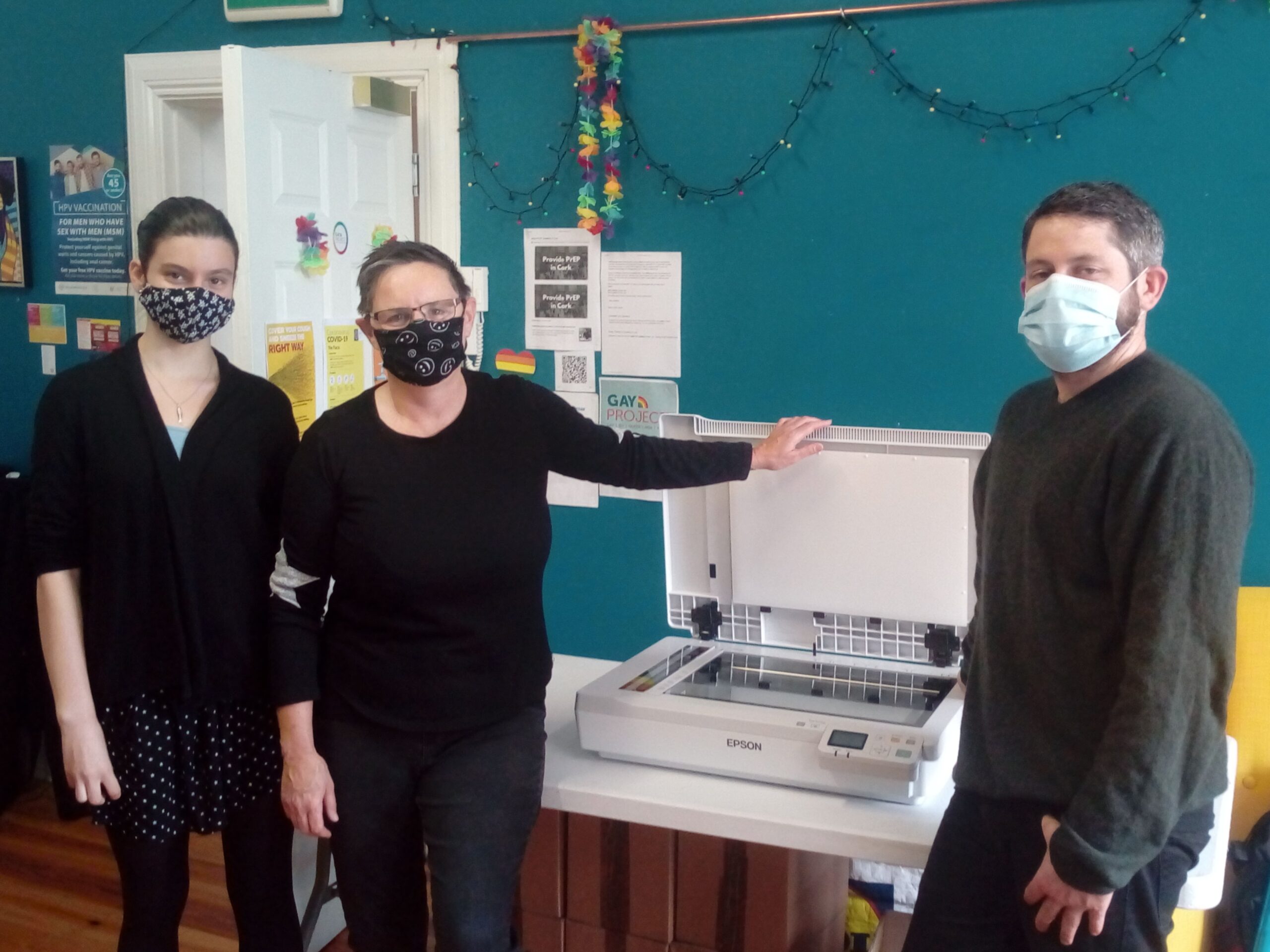
Opening the new scanner (Epson DS50000)
So much has happened within the space of one month at the Cork LGBT Archive! The next series of blog posts will be published throughout August, as we catch up with all the excitement that this project has had to offer.
After some initial hurdles, we had some advances in terms of the workflow process. Previous scanning processes in the Cork LGBT Archive were made efficient by Orla and her colleagues by selecting software that was suitable and not too cumbersome. So my job was to look for ways to make this happen with their new scanner.
A series of different image scanning software applications were identified which were available to us for free, but as we will see in this post, it is not an easy task to locate one that is both simple and straightforward! The way that scanner software has evolved in the past few years is simultaneously excellent and flawed – informing us that automation is not always the best way forward. And the Epson Workforce DS-50000 flatbed scanner had its quirks!
setting up the scanner
After we unboxed our new scanner, we found that a hardware component called a “Network Interface Component” was already installed. This caused problems for the installation, as it was not possible to setup a USB connection to the laptop out of the box. With the interface connection the idea is that you are connecting the scanner to a number of computers instead of the method that we have become accustomed to of “plug-and-play” – you plug it in, and it works! Coupled with that, there were no instructions included with the scanner to show what needed to be done when setting up the machine to carry out a simple scan to laptop via USB. So the initial excitement of getting setup right away and firing up a scan were dampened, instead calling for a bit of serious investigative work (some tinkering was needed). After attempting the network connection on a number of different pieces of software (Epson Scan 2, Document Capture Pro, Windows Fax and Scan), I tried to connect to the printer using a Mac.
When this also failed, I had a conversation about it with Orla’s partner, Carol. Zooming out from the situation, we decided that the most obvious option to try was to actually remove the Network Interface component and to swap it for the standard component that had been left beside the printer.
Image of network interface component on the left and the standard “USB” component on the right
I was a little wary of taking the scanner apart since we had only just bought the product! This initial work with the scanner required that I dis-assemble the Network Interface component with an Allen key (and awkwardly removing screw covers that had somehow been turned the wrong way around inside of the screw slot)! It was a bizarre situation to have to swap this out, as it was awkward and risked breaking something on the scanner. However, once this had been swapped for the standard component, we discovered that the scanner software eventually recognised the scanner and then everything worked without a hitch.
All better in hindsight of course!
Scanner and scanner software in operation
The Network Interface Component did sound useful for some situations – it means that a number of devices can be connected to the scanner at one time (phones, laptops, PCs). However, for a job such as this, it was determined that only one person and one computer was needed for the scanning job at any one time, this suited our workflow best. It was decided that it would make more sense for the workflow if one person was positioned at a designated computer, connected by USB to the scanner whilst scanning documents instead of multiple people connected to the machine at once. The Network Interface Component was returned to the original box!
In terms of hardware, our initial sense of the scanner was that it operated quite fast, and the sound of a scan wasn’t too clunky! In general, it promised to make the scanning very efficient, one click of preview or scan button, the scanner moved across the bed quite fast, and you had an image within 4-5 seconds. However, a 600 dpi scan required the move across the bed to slow significantly, so we ended up with 10 seconds per scan.
Finding Software
For software needs, one of the most important areas needed for workflow in the Cork LGBT Archive was the ability to be able to create PDF documents that contained a number of different scanned images bundled together (to add or edit pages after scanning). It became apparent that this was available in both software packages that we tried out, Epson Scan and also Document Capture Pro. With this option available, we could then move on to testing for other features.
There were a number of software packages that allowed us to scan PDF/A documents, which was a major boon as the Digital Repository of Ireland (the DRI) preferred PDF/A format. One of those packages that afforded PDF/A was Epson Scan, which also provided the option of scanning to a searchable PDF for text documents. Epson scan also allowed for rotation and “correct document skew”, both very helpful features. Another plus was that there was the ability to create “Multiple TIFF” images, and in advanced settings to remove background, to enhance text and to change brightness, contrast, and gamma. Another option we had for this was that with the utility installation of this scanner software came an image editor named “Document Capture Pro”.
Overall, the settings available with both of these software packages were quite similar, as the Epson Scan software was used by Document Capture Pro every time a scan was requested. One feature that was not available in Document Caputre Pro was the ability to crop images during the workflow. During the testing of the scanner, it became apparent that the scanner software cropped images automatically, but in many cases not accurately. This meant that the white background surrounding images was in view on some occasions, and not on others. Worse still, sometimes part of documents were cut off.
I then tested other scanner software options to see if manual crop could be available. ArcSoft PhotoImpression was a good option, but it didn’t meet our needs. Another option that allowed us to crop images was Digitech’s PaperVision Plugin for Document Capture Pro. This website was useful in our search – it compared some of the other free versions that are available, plus important information on which ones had auto and manual cropping: https://turbofuture.com/graphic-design-video/Whats-the-Best-Multiple-Photo-Scanning-Software
We found that when using Document Capture Pro that there are two options in the main menu –
1) To do a job scan. This allows you to setup a workflow for a scanning job, which has predefined settings for the scan, a destination for the file once you have finished the scanning.2) Simple scan. This allows you to scan without taking any actions, and is not a workflow but just a scan that can give you the scanned image and then you can do what you want with it yourself.
The following list of other scanning software options that demonstrate what is available as of summer 2021:
AutoSplitter – very basic looking interface, has no PDF save format, has crop functionality but requires once-off payment of $30 for 2 yearsVueScan (also an app on android) Once-off payment of €20 – cropping is done based on pre-defined size of image, no crop toolPixEdit (Norway) €75 per month
In previous version of Epson scanner software, the manual cropping tool was available. For example, Orla had used a very nifty tool in the Epson Expression 11000XL. With little availability of open-source tools for cropping images, I decided to test to see if the new scanner would work with older versions of the Epson scanner software (Epson Scan). However, this application did not open correctly as the scanner was not recognised (Epson Expression 11000XL). Error message, “Epson Scan cannot be started”.
Eventually, after further searches for “cropping” in scanning software, a search result listed on an interesting website named UtahRails.net, where I found this thread: https://utahrails.net/tech-talk-photos.php … finally, a recommended software called “FastStone Image Viewer” proved to be an excellent find for our job.
One contributor on the UtahRails website mentioned that, “I generally use FastStone Image Viewer for the basic stuff, like adjusting gray levels on black & white photos, or color levels on color photos. It also works very well for straightening and cropping, and simple resizing. It also has a good batch conversion tool to convert TIF to JPG, for uploading to SmugMug.“
This was a watershed moment. After all of our searching and testing, finally we found a suitable piece of open-source software that could produce scans to our liking, which were also of an excellent quality and we had the ability to crop manually. On to the workflow!
Setting up a workflow
As week three started, the excitement was building with the knowledge that we were now set up to scan our first box of documents. We ran some tests to check if the scanner and accompanying software would produce the desired PDFs of documents.
Again, this was not without its problems, as we quickly discovered in some of the previews that the documents were not being imaged on the very outer edge of some of the documents. In some cases parts of documents were cut off when they were placed against the edge of the scanner. The scanner did have a line which demarcated the edge of an A4 scan, but even when following this rule we discovered that it sometimes cut off part of the image.
We needed to come up with a way to push the document further into the scanner. As an interim decision, we placed wooden pegs at the edge of the scanner bed. This allowed documents to be placed up against their edges, facilitating an easier cropping and allowing for the full version of the document to be seen after a scan was made.
Image of scanner “interventions”
Innovative scanning at Cork LGBT Archive today!Trying to find something straight in @GayProjectIRL to line up Play Safe leaflet for scanning – eventually found colourful lollypop sticks in the Arts & Crafts corner. @MiraDean8 @drpatrickegan @OrlaEgan1 Creative #DigitalArchives pic.twitter.com/6pLZRIKDWZ— Cork LGBT Archive (@CorkLGBThistory) June 15, 2021
As we began to scan documents, we discovered that the workflow was turning out to be perfect for our needs. We were able to scan efficiently (with minimal set up for documents), and the process was uncomplicated (move the documents towards the sticks, crop later).
With the scan process set up correctly (and happy staff working away on the scanning!), I could now turn my attention to metadata description, to getting an overview of items that were already within the DRI and Cork LGBT Archive, on to some coding and “motivational Cork LGBT Spotify Playlists”!
Have you had similar experiences with scanning setup and workflow? We would love to hear from you, please leave your comments below. [...]

July 8, 2021In June 2021, I began a four month position with the Cork LGBT Archive, working for my friend and colleague, Orla Egan. We both attended UCC together since 2014, and shared an office during the past number of years. Orla’s work has always interested me, as the archive that she works on originated in a basement! Since I have known Orla, she has been sorting, digitising, promoting and sharing all sorts of interesting insight into this fascinating project.
CAHG Scotland & SCA
As digital archivist, my job has been to oversee the workflow of digitisation from box to digital repository. I also liaise with the Digital Repository of Ireland (DRI) on best practices, and have been set up by Orla on the webinar series by the Community Archives and Heritage Group (CAHG) Scotland & Scottish Council on Archives (SCA). The CAHG & SCA deliver training and networking events to support and provide skills to volunteers in community heritage groups (more about them here: https://www.scottisharchives.org.uk/). The 2021 series deals with the following topics:
How to digitise your archive collections.Increase visibility of your digital collections.Strategically promote your digital collections and optimise your collection for discovery via Google and other search tools.Increase your engagement with your local community and beyond.
Armed with these connections, some research, webinars, library experience and a good deal of enthusiasm, I was ready to make a start with the Cork LGBT Archive project.
Week 1: An Overview
First and foremost, to keep track of steps involved with the project, a series of promotions were in order. Sharing tweets about the first weeks working with the Cork LGBT Archive, and representation with the Irish Heritage Council were important. The main aim was to document the process alongside other members of the team as we went along. The promotion was backed up with these detailed blog posts about the steps involved in the project.
In week one, three important first steps were to:
* plan for the project review every month* manage ingesting documents into the DRI* investigate formats that were needed for this ingestion
The DRI provides a very helpful formats guide, which allowed us to understand their requirements for Cork LGBT Archive to be ingested into their repository. The general guideline was that PDF/A was a preferred format for archiving, and that PDF was also acceptable. Some initial explorations into this revealed that:
PDF/A is good for some images and not for others (see: http://www.archives.nysed.gov/records/mr_advisories_pdfa.shtml)PDF for multiple images is okay, but PDF/A is better. It allows you to add extra “technical” metadata to the PDF file so that the metadata can be portable – it can move with the file wherever it goes. PDF/A also embeds fonts, which makes sure it is reproducible across systems. It is also strict – it doesn’t allow embeddings other than images (videos etc.).
Organising a workflow
The most important step in the digitisation and ingestion process for the DRI was to establish a way of organising how every part of the process fitted together. This has obvious advantages, “fail to plan, plan to fail”, but it also has others – for speed, efficiency, accuracy and quality.
Audit of the Cork LGBT Archive
Firstly, what material has been digitised, and if material exists elsewhere, will it be needed for this phase of the projectDo we need to update new scans with consistency of what has already been completed? How might this work on an ongoing basis?What is the process for digitisation with this scanner (Epson DS50000)What are the goals of these outputs – how much more material in the DRI and/or the Archive?Will this phase produce best practices / guidelines to enable consistently in the future?
Backup
The main goal of backup is to ensure that the Cork LGBT Archive is safe from data loss. In order to achieve this, we looked to best practices in establishing the most reasonable methods that a community archive could align with for cost, quality and consistency. We decided to work out the “3 2 1” rule of data backup for this project (https://www.armstrongarchives.com/3-2-1-rule-data-backup/)
This rule basically means three things – 3 copies, 2 on media, 1 offsite.
For the Cork LGBT Archive, this meant –
Where is data currently stored?How is it currently stored?How can we meaningfully back up the new data as it comes in, without creating a whole new system?
To answer the first question, it was determined that there were three locations:1) On a recently purchased HP laptop2) On a 4TB external hard-drive3) In the cloud (Dropbox)
The recently purchased laptop had a capacity of 256GB which was determined to be unfeasible as a permanent backup. There were 2TB storage capacity on cloud storage through Dropbox and 300GB was already in use. Traversing different storage locations was an important aspect of the process of backup. The External Hard Drive contained 4TB, and as each item was saved, it could be sent to Dropbox.
A further external hard-drive could then be bought to store the final permanent backup off-site and backed up every month.
The next question we arrived at was, what type of software did we want to use to monitor changes in backups, and how would this workflow be established. I had already used AOMEI Backup on my own machine, but our team member Jacob suggested to use GitHub.
The Digital Repository of Ireland (DRI)
It was determined that a previous ingest of material from the Cork LGBT Archive was carried out with the DRI, where they already had a repository on their website. Orla had previously worked with Anita, Kathryn and Kevin at the DRI to make this happen. This setup allowed me to become familiar with the way that material has been presented there and the way that the backend looked.
Day 1
I identified that there are some aspects to the original workflow that could be improved. The first is the scanning of documents. In the case of scanning to jpeg, it was determined that the project workflow could be made more efficient with the use of batch operations to convert TIFF files to JPEG in new destination folders. Carrying out this type of batch operation meant that this would cut the scanning workload in half, as previously both JPEG and TIFF files were created during the digitisation process. It was determined that automating made no difference to the quality of the operation as the file names of TIFFs and JPEG could be the same (and were previously).
Secondly, it was found that booklets that were originally scanned as JPEGs had been scanned to the PDF format, and this made one file out of many. This was determined to be a reasonable compromise, as PDF/A is not currently available without subscription on Adobe software. Also, the benefits of PDF/A are not relevant, as the project does not have a need for portable fonts, or for technical metadata (that is metadata which is stored inside of the PDF file itself). *See later posts for updates on this.
Europeana: DRI data had already been harvested for Europeana. We needed to make sure new material was also ingested. So a key goal was to find out if this was to ask staff at the DRI if Cork LGBT material gets updated with Europeana, and what the protocol is for new items that are added to a collection after the first ingest.
Developing a Catalogue
It was found that Cork Museum is currently carrying out a project to catalogue a number of documents that are from the Cork LGBT Archive, which will include pencil marks itemizing each document that is catalogued. It was determined that a catalogue could be made of these documents for retrieval later on by researchers. It was suggested by Orla that these documents could be used to form a catalogue in such formats as EAD, ISAD(G) or some other suitable archiving standard, and that this catalogue numbering system could then be used in other resources of the Cork LGBT Archive situated either on the DRI website or on the corklgbtarchive.com website within the “Related To” Dublin Core metadata.
Goals for this section became to:
Find out how you can start a catalogue. What way will the numbering system work? How do we get those numbers into all digital systems?Meet with Orla and staff from the museum to discussResearch suitable finding aids for this type of material (interns at the museum had started to add identifiers in pencil marks on material)An identification system was needed to let people know what is in the museum and on DRI (maybe an item number added to the “related to” field of the Dublin Core metadata here), so that they could get access to each document
Subject headings
The metadata subject heading options for LGBT are varied, but two main ontologies are available and currently in use: Homosaurus and the Library of Congress authorities which are available at https://authorities.loc.gov
Example 1: A list of Irish organisations is needed – an archives guide, for how to put names of people (eg egan, orla 1966-)Example 2: there are no “dike bars” in Homosaurus
It was found that some of the subject headings that were previously missing from the Library of Congress can be found under a different heading name (for example “Dike Bars” can be found under “Lesbian Bars”). In this case, there can be confusion around what heading should be used, as it may be political or a preference depending on who is being referred to. It has been made clear from the Cork LGBT Archive team that previous attempts to add information were not carried out, as the information was not made available to the person(s) contributing items to the Archive. It is recommended therefore to print out a series (maybe one page list) of possible subject headings (with brief descriptions) that are already either in Homosaurus or on the Library of Congress Subject Headings resource in order to make prompts available to the person who is scanning / contributing material.
Digital Repository of Ireland
Through investigating what the DRI recommended, it was found that we could scan in high-res JPEG, in TIFF and PDF. The latter is an acceptable format, even though PDF/A is preferred.
A number of smaller issues also arose when discussing the PDF format. Without the Adobe Pro software to rotate PDFS, a previous staff member would get her partner to rotate the PDF instead.
In a previous batch ingest for the DRI, the Cork LGBT Archive team had utilised a file for the operation. Similar to the audit of the state of the Cork LGBT Archive then, the Archive’s presence on the DRI resource needed to be understood. Part of this understanding was to investigate the system that was set up for workflow in previous ingests. For a start, it was determined that this involved DCMES xml files
Another minor issue was to define a method for file naming, as this had not been made clear. It was determined that complying to a standard was best, and this involved some important rules. A helpful guide for best practices is located here:https://libguides.princeton.edu/c.php?g=102546&p=930626
At this point 397 items were already on the Cork LGBT Archive website
A question to be asked was: how were booklet PDF’s originally made, and what was the process? Could it be that we use this process: Scan > Save as images > Open Acrobat > Add images > Send to DRI > Save in archive? For the new scanner that was acquired, we needed to think about PDF/A and the auto-rotate feature. Our scanner (Epson WorkForce DS-50000) facilitated both PDF/A creation, and auto-rotate. It also came with a “Dual Image Output”. However, there were other problems with this workflow. The process of cropping images manually was used in the older version of this scanner software, but did not seem to be available to us in the newer model. Test scans revealed some issues with the auto-crop, which will be explored in the next blog post.
Conclusion
In all, the first weeks of this project demonstrated a wide variety of different processes at work, and a lot of variables to manage. Within each stage of the process (from box to digital repository), there were specific challenges and a number of “to do” lists, each one having a potential impact.
On the other hand, this archive is not represented by any institution, and so there is a great deal of flexibility on what can happen with material and the workflow that is involved with the project. This has been the interesting part of the Cork LGBT Archive, and gives it an “edge”.
More to come in the next blog post! [...]
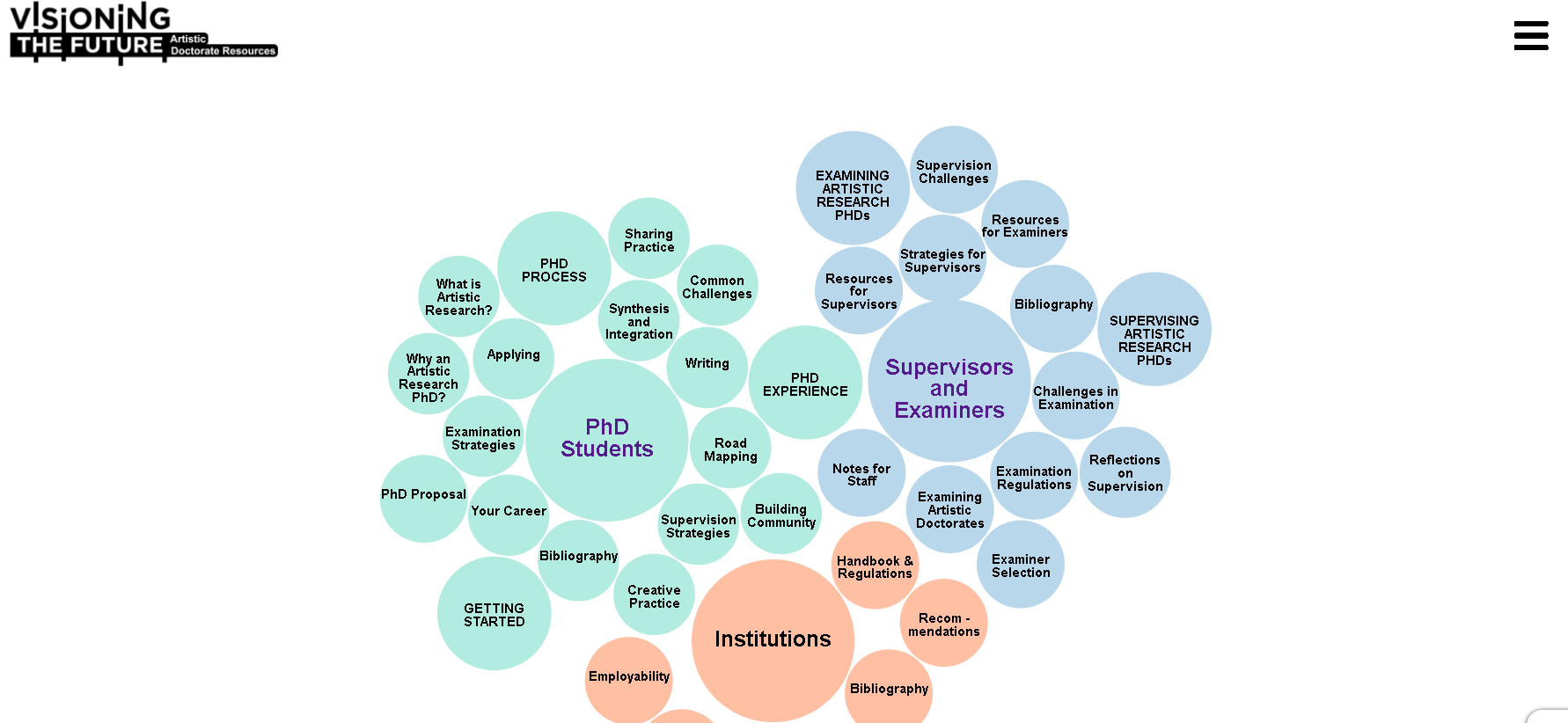
February 9, 2021In January 2021, Dr Egan worked with the Department of Digital Humanities and the Department of Music in UCC to create a web resource, www.ArtisticDoctorateResources.com which required a novel digital visualisation for a text-heavy website navigation. In order to achieve this, the Javascript library D3JS was used by implementing a version of a force layout. The existing D3 . More on that type of visualisation can be seen here.
The resultant visualisation can be seen below and is available to developers at: https://github.com/rootseire/forceCluster
rootseire.github.io/forceCluster [...]

July 2, 2020Since graduating with minor corrections in his PhD research, Patrick has been writing articles for publication in digital humanities, interdisciplinary studies and ethnomusicology. His latest article has been submitted for peer review. A word cloud that hints at its contents can be explored below. [...]
February 22, 2020R is a free software environment for statistics and graphics. Alongside Python, it is one of the most popular tools used for statistical analysis. R was released in 1995 and the current version is 3.1.3. As of 2018, Python is still an extremely popular programming language, but R has been rising in popularity of late, according to the Tiobe Index. https://www.tiobe.com/tiobe-index/r/ A word of caution however – the popularity of programming languages can change quite rapidly within the space of a year.
R vs Python
One of the main differences between R and Python is that instead of being a general purpose tool, its main focus is on statistics. Therefore, it enables features for powerful data visualisation that are not possible elsewhere. Another difference is that Python focuses on code readability, whereas R comes with support for user friendly data analysis.
Why Learn R?
There are numerous advantages to learning R. It is easier for beginners who want to explore, as you can setup a model within a few lines of code. In other programming languages and tools, you would have to carry out a number of tasks in order to get something up and running. By seeing the possibilities of your code early on, you can imagine and understand the possibilities sooner rather than later.
Part I: Getting Started with R
This first tutorial will guide you through the basics of R through to an example from them of how to get it to work. We will run through an example download, setup and run of the software. In part II, we will then look at using a CSV file with R in order to understand how to use real-world examples.
There are two ways to install and use R, one is with the R Studio, available at https://www.rstudio.com/. R Studio is an Integrated Development Environment (IDE) which basically allows you to use a source code editor, build automation tools and provides a way to debug your code.
Why use the console version then? The main reason for using the console is that the IDE is normally used by developers for making programs, but in this tutorial we only want to run some lines of code to see what is possible – so we don’t need all the extra add-ons. If involved in a large project, it would then make sense to have the extras of the IDE.
For this tutorial, you can use a any text editor (such as Notepad or Text-Edit or even R’s Command-line interface to edit and run an R script).
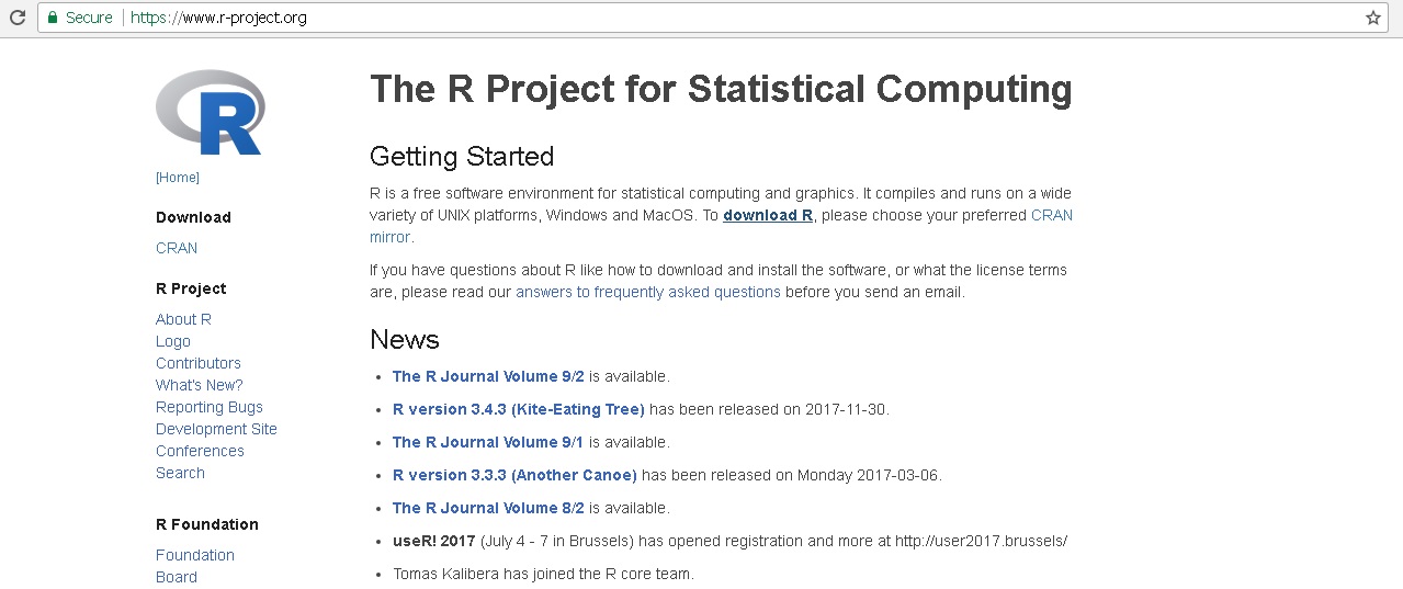
So first off – visit R’s official project homepage. https://www.r-project.org/. You should see this screen:
There are a number of different installation packages available depending on your computer setup. To select the correct software from the R website, visit the page https://cloud.r-project.org/ where you will be presented with the following screen:
Choose the software download that you need by clicking on the “Download R” link for your computer’s operating system at the top of the page. For demonstration purposes, this tutorial will look at the Windows installation.
Once you have picked your own operating system, you will be brought to a page that should have your operating system appear as the heading with the download link for R underneath. As can be seen in the example below, the file we are going to download is about 60Mb in size, so we can select the first link at the top of the page:
Once you click on this link this software is downloaded, and you can install it. Run the setup and once you have finished, you should be presented with the following window:
Double click on the newly installed software’s icon on your desktop or in the program menu, and the Graphical User Interface for R appears. You can see a menu at the top with a sub-menu then a “console” which has some copyright and licencing information, followed by some system information and then a cursor with some options. This is where you can communicate with the software.
R looks a bit daunting at first, because there are no handy buttons to open files with, and when you click on the “open” button, the only files that can be opened are “R” files or it’s predecessor “S”. The reason for this is that you are supposed to open scripts that are written in R so that you can complete programming operations on your data files, but you are supposed to actually import your data files.
To communicate with the software, click inside of the console window and type the command that simply says
print ("Hello World")
the program should respond like this:
print ("hello world")
"hello world"
Digging Into Data – The Activity of “Old Faithful”
Now that we are getting a response from the program, we will want to do more. To clear the console, simply use the keyboard shortcut, Ctrl+L or on a Mac, Option+Ctrl+L.
You can bring up a list of datasets by simply typing data(). This will bring up a window that shows the list of datasets which are already built in (real-world examples which have been downloaded with the software) and some information on them:
To load these datasets, simply type the command data(name of dataset) and this command adds that dataset into your console. It doesn’t show it, because data(name of dataset) is simply loading the data. To view these datasets, you only have to type the actual name of them once they are loaded.
In this example we loaded the eruption data for Old Faithful by typing
data(faithful)
and then just
faithful
You can see the data on the left hand side, inside the console which looks like a database entry – the id of the eruption is in the first column, and the “Waiting time between eruptions and the duration of the eruption for the Old Faithful geyser in Yellowstone National Park, Wyoming, USA.” The “Format” of this dataset then is described as “A data frame with 272 observations on 2 variables.” For more information on what these datasets do, visit the R documentation website at: https://stat.ethz.ch/R-manual/R-devel/library/datasets/html/
These datasets can now be traversed with R commands and visualised in seconds! For example, in the case of Old Faithful, visit the webpage https://stat.ethz.ch/R-manual/R-devel/library/datasets/html/faithful.html and copy all of the code at the bottom of that webpage, it starts off like this:
require(stats); require(graphics)
f.tit <- “faithful data: Eruptions of Old Faithful”
Paste this code into your console window, and observe what it does with the data. The code loads in some graphics and tells R what needs to be drawn. R then plots this data with the graphics and under instruction it produces a visualisation:
This simple example shows what can be done using R. Think about your own ideas and what it might be useful for. Try the other examples and see what they show and how the plotting is done. Continue to get an idea for what R is useful for, and then we will try out our own data.
More R Commands
Return to the console and type ‘summary(faithful)’ to see what this does. Below we can see the minimum, the maximum and the average wait times overall.
Interpreting Our Code, Working with Variables (advanced)
In order to understand the above code for our graph, we need to go through it line for line (this will help us later when we create our own graphs).
f.tit <- “faithful data: Eruptions of Old Faithful”
This means that the graph title on the right hand side will be stored as f.tit
Think of f.tit simply as shorthand for the sentence
Now look at the other code such as
“ne60 <- round(e60 <- 60 * faithful$eruptions)
faithful$better.eruptions <- ne60 / 60
te <- table(ne60)”
These lines of code simply assign values to different parts of the graph that we draw. In the end, they are plotted with x and y axes, title, colours and values.
So any time you see <- in a line of code that means that the value on the right hand side is being stored in the value on the left hand side. Once it is stored, it is then called a “variable”. You can access all of your variables by typing
'ls()'
To remove any of these variables, simply type ‘rm(name of variable)’ and then type ‘ls()’ again.
Part II: Creating Your Own Projects
Now that you have went through a setup of R, opened datasets that are built-in and understood what the code is about, we’ll look at a real-world example. Once you have a hang on this second part, you can really start to see how practical examples can be carried out. For this second part, we will download a sample CSV dataset from the World Wide Web, and see what we can do with it. The dataset chosen for this tutorial is “Angling Stands” around Roscommon, a practical (and small) example to work with. It can be found here: https://data.gov.ie/dataset/roscommon-angling-stands1
From this webpage, download the CSV file Roscommon_Angling_Stands.csv, and rename it to file.csv for ease of use.
What we need to do now is feed in the CSV file from outside of the R program – to locate the file in a directory on your computer.
Before we can access the file, we need to setup a directory. In order to import your data files, you need to set the directory where R is going to look for them. In some cases it is best to create a folder on your C: drive. Go onto your start menu and open “My Computer”. When Windows Explorer opens up, double-click on C: and create a new folder in there called “RData”:
Now return to the R program, clear the screen CTRL+L or Option+Ctrl+L and in the command section type:
setwd("C:/RData") – this sets the current working directory to RData (where you will store file.csv)
getwd() – shows the current directory that R is pointing towards
list.files() – shows the current list of files within that directory
The setwd has now set the current working directory of the R software to the new folder created on the C: drive. Put the Roscommon Angling file (which you renamed to file.csv earlier in this tutorial) into the RData directory on the C: drive. You can now read that file into the console by typing:
myData <- read.csv(“C:/RData/file.csv”, header=TRUE)
This will add your data to the software’s memory, in shorthand (or variable) as myData. It can now be read by the software in different ways. See if you can access it – here are some examples:
myData – view all of your data
head(myData) – shows the column headers for your data with some data
myData – all of the rows between 1 and 20 plus the columns
names(myData) – shows the columns only
Just as in Excel where you can view and edit data based on columns and rows, you can run a line of code in R to see a similar type of layout. Here is that line:
fix("myData")
Mapping with Leaflet
Our file.csv contains a number of different latitudinal and longitudinal co-ordinates. Next thing we are going to do is to plot these points in R in combination with LeafletJS, an open-source mapping tool. R brings the processed data, Leaflet brings the mapping software.
Our file.csv is already loaded into memory and waiting to be processed, we can now add the leaflet package.
Adding Leaflet
In the R GUI, go to Packages>Install Package(s)
In the next window, select “UK”, and then in the following window, scroll down and double click on “leaflet”
It will begin loading up the package. Once this has installed, return to the console window and type:
library(leaflet)
There should be no response, only that the cursor moves onto a new line.
If so, now we are ready to combine file.csv with leafletJS.
To create a new map simply type the following:
newmap=leaflet()
newmap=addTiles(newmap)
newmap = addProviderTiles(newmap, provider = "CartoDB.Positron")
newmap=setView(newmap, lng =-8.18333, lat=53.63333, zoom=15)
To view this new map simply type
newmap
Congratulations – You have created your first map with R and Leaflet! You can change the BaseMap simply by editing the “CartoDB.Positron” above, and running that same line of code. Have a look at your options on the right hand side over at this page: http://leaflet-extras.github.io/leaflet-providers/preview/
So now that this is working, we want to read in the markers in order to populate this map. First we will create one marker to test. Copy and paste the code below into your console window and hit enter:
newmap=addMarkers(newmap, lng =-8.18333, lat=53.63333, popup="Roscommon")
If that runs ok, that’s one marker completed. Go ahead and test your map with the “newmap” command to see if it shows up. To fill everything in from the csv file, just copy and paste the following code in the same way:
newmap=addMarkers(newmap, lng = myData$WGS84Longitude, lat =myData$WGS84Latitude, popup = paste("Name:", myData$Name, "
", "Type:", myData$Type))
Summary and Full code for part II:
Download the CSV (from https://data.gov.ie/dataset/roscommon-angling-stands8b404)
Rename it file.csv
Create a folder on the C: drive called RData
Copy and paste the file.csv into RData folder
In R:
setwd(“C:/RData”)
myData- read.csv(“C:/RData/file.csv”, header=TRUE)
library(leaflet)
newmap=leaflet()
newmap=addTiles(newmap)
newmap = addProviderTiles(newmap, provider = “CartoDB.Positron”)
newmap=setView(newmap, lng=-8.1333, lat=53.65333, zoom=10)
newmap=addMarkers(newmap, lng = myData$WGS84Longitude, lat =myData$WGS84Latitude, popup = paste(“Name:”, myData$Name, ”
“, “Type:”, myData$Type))
This is just one of the many ways you can work with R. Have a look at the other tutorials online, such as at The Programming Historian which shows how to work with Tabular Data: https://programminghistorian.org/lessons/r-basics-with-tabular-data. What other ways can we get R to help us with datasets? [...]
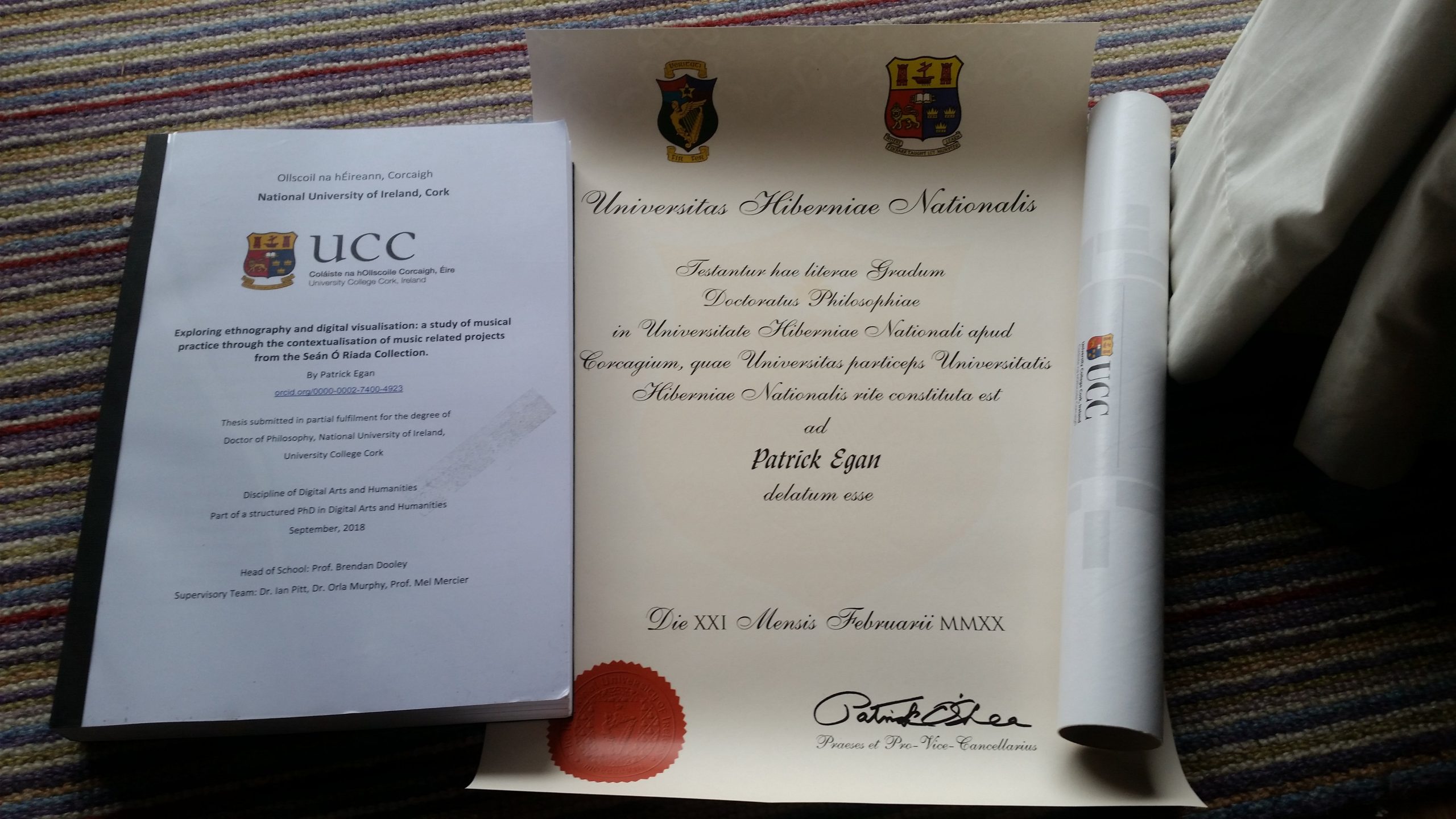
February 21, 2020Title: Exploring ethnography and digital visualisation: a study of musical practice through the contextualisation of music related projects from the Seán Ó Riada Collection. PhD Thesis, University College Cork.
Abstract: This thesis explores how cultural data of musical practice is contextualised during the process of digital visualisation and ethnographic research. The investigation utilises a two-pronged approach to examine music related projects from an archive, the Seán Ó Riada Collection, and focuses on how mid-twentieth century Irish artist Seán Ó Riada rose to prominence. Humanities scholars and digital humanists are increasingly engaged with digital technology in their work. Although ethnography and digital visualisation have often been used in research, both processes are beginning to be used in tandem. This project makes an original contribution to the scholarly literature through interrogations of how a hybrid of concepts and methodologies drawn from digital humanities and ethnomusicology may work in tandem or may be complementary. Practice theory is advanced as a suitable methodology for historical analysis, facilitating an investigation of musical practice in order to reveal evidence of change or continuity during the development of Seán Ó Riada’s career. Analysis of music related documents discovered within the Collection is framed by the circumstances through which projects were rehearsed and presented to audiences in a number of different mediums. I argue that the development of digital datasets and iterations of visualisation enable more informed questions and suitable theories to emerge when engaging with the contents of archival collections. I also argue that as a result of this activity, the selection process for suitable methodology and theory (such as event-based research) are important considerations when attempting to combine the practices of ethnography and digital humanities. This thesis also examines the complexities that emerge with exploring musical practice with digital cultural data, arguing for deeper engagement with data and digital tools in the structures where they are recombined and represented. Digital practices are perceived as challenging, informative and evolving processes of engagement. The debate concerning the use of more elaborate systems of classification for the representation of cultural data is not solved, instead it is utilised constructively and considered as part of an ongoing, self-reflexive process of research that enables knowledge discovery. In addition, this study introduces a series of semi-structured interviews that were carried out in order to assess the accounts of performance related activities, related by contemporaries and critics of Seán Ó Riada. The ethnographic section of this thesis demonstrates how ethnomusicology contributes to an improved interpretation and understanding of digital data. This study contributes to the ongoing discussion about digital humanities activities in ethnomusicology and ethnomusicology in digital humanities. It demonstrates the use of novel digital processes alongside long-form ethnographic fieldwork to contextualise historic materials in archive collections.
Cite: Egan, P., 2019. Exploring ethnography and digital visualisation: a study of musical practice through the contextualisation of music related projects from the Seán Ó Riada Collection. PhD Thesis. Cork: University College Cork.
Digital visualisation of Seán Ó Riada’s music-related projects: https://oriada.o-em.org
Download here
Full description available at https://cora.ucc.ie/handle/10468/9604 [...]

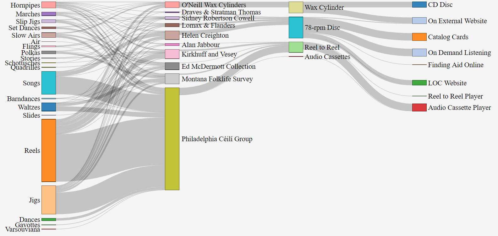
December 12, 2019Datasets from the Library of Congress include all outputs from the Connections in Sound project. The following is a description of these resources, which can be found at www.github.com/rootseire/LC-ITM
AFC Sankey
Sankey visualisation of audio recordings from the American Folklife Center at the Library of Congress
Dataset originally created 03/01/2019 UPDATE: Packaged on 04/18/2019 UPDATE: Edited README on 04/18/2019
I. About this Data Set This data set is a snapshot of work that is ongoing as a collaboration between Kluge Fellow in Digital Studies, Patrick Egan and an intern at the Library of Congress in the American Folklife Center. It contains a combination of metadata from various collections that contain audio recordings of Irish traditional music. The development of this dataset is iterative, and it integrates visualizations that follow the key principles of trust and approachability. The project, entitled, “Connections In Sound” invites you to use and re-use this data.
The text available in the Items dataset is generated from multiple collections of audio material that were discovered at the American Folklife Center. Each instance of a performance was listed and “sets” or medleys of tunes or songs were split into distinct instances in order to allow machines to read each title separately (whilst still noting that they were part of a group of tunes). The work of the intern was then reviewed before publication, and cross-referenced with the tune index at www.irishtune.info. The Items dataset consists of just over 1000 rows, with new data being added daily in a separate file.
The collections dataset contains at least 37 rows of collections that were located by a reference librarian at the American Folklife Center. This search was complemented by searches of the collections by the scholar both on the internet at https://catalog.loc.gov and by using card catalogs.
Updates to these datasets will be announced and published as the project progresses.
II. What’s included? This data set includes:
data-april-2019.zip – zip file containing 2 .CSV files and a README file
items – a .CSV containing Media Note, OriginalFormat, On Website, Collection Ref, Missing In Duplication, Collection, Outside Link, Performer, Solo/multiple, Sub-item, type of tune, Tune, Position, Location, State, Date, Notes/Composer, Potential Linked Data, Instrument, Additional Notes, Tune Cleanup. This .CSV is the direct export of the Items Google Spreadsheet
collections – a .CSV containing Viewed?, On LOC?, On other website?, Original Format, On Website, Search, Collection, State, Other states, Era / Date, Call Number, Finding Aid Online?, Tune Names?, Tune Details, Quantity of Recordings
III. How Was It Created? These data were created by a Kluge Fellow in Digital Studies and an intern on this program over the course of three months. By listening, transcribing, reviewing, and tagging audio recordings, these scholars improve access and connect sounds in the American Folklife Collections by focusing on Irish traditional music. Once transcribed and tagged, information in these datasets is reviewed before publication.
IV. Data Set Field Descriptions
IV
a) Collections dataset field descriptions
ItemId – this is the identifier for the collection that was found at the AFC
Viewed – if the collection has been viewed, or accessed in any way by the researchers.
On LOC – whether or not there are audio recordings of this collection available on the Library of Congress website.
On Other Website – if any of the recordings in this collection are available elsewhere on the internet
Original Format – the format that was used during the creation of the recordings that were found within each collection
Search – this indicates the type of search that was performed in order that resulted in locating recordings and collections within the AFC
Collection – the official title for the collection as noted on the Library of Congress website
State – The primary state where recordings from the collection were located
Other States – The secondary states where recordings from the collection were located
Era / Date – The decade or year associated with each collection
Call Number – This is the official reference number that is used to locate the collections, both in the urls used on the Library website, and in the reference search for catalog cards (catalog cards can be searched at this address: https://memory.loc.gov/diglib/ihas/html/afccards/afccards-home.html)
Finding Aid Online? – Whether or not a finding aid is available for this collection on the internet
b) Items dataset field descriptions
id – the specific identification of the instance of a tune, song or dance within the dataset
Media Note – Any information that is included with the original format, such as identification, name of physical item, additional metadata written on the physical item
Original Format – The physical format that was used when recording each specific performance. Note: this field is used in order to calculate the number of physical items that were created in each collection such as 32 wax cylinders.
On Webste? – Whether or not each instance of a performance is available on the Library of Congress website
Collection Ref – The official reference number of the collection
Missing In Duplication – This column marks if parts of some recordings had been made available on other websites, but not all of the recordings were included in duplication (see recordings from Philadelphia Céilí Group on Villanova University website)
Collection – The official title of the collection given by the American Folklife Center
Outside Link – If recordings are available on other websites externally
Performer – The name of the contributor(s)
Solo/multiple – This field is used to calculate the amount of solo performers vs group performers in each collection
Sub-item – In some cases, physical recordings contained extra details, the sub-item column was used to denote these details
Type of item – This column describes each individual item type, as noted by performers and collectors
Item – The item title, as noted by performers and collectors. If an item was not described, it was entered as “unidentified”
Position – The position on the recording (in some cases during playback, audio cassette player counter markers were used)
Location – Local address of the recording
State – The state where the recording was made
Date – The date that the recording was made
Notes/Composer – The stated composer or source of the item recorded
Potential Linked Data – If items may be linked to other recordings or data, this column was used to provide examples of potential relationships between them
Instrument – The instrument(s) that was used during the performance
Additional Notes – Notes about the process of capturing, transcribing and tagging recordings (for researcher and intern collaboration purposes)
Tune Cleanup – This column was used to tidy each item so that it could be read by machines, but also so that spelling mistakes from the Item column could be corrected, and as an aid to preserving iterations of the editing process
V. Rights statement The text in this data set was created by the researcher and intern and can be used in many different ways under creative commons with attribution. All contributions to Connections In Sound are released into the public domain as they are created. Anyone is free to use and re-use this data set in any way they want, provided reference is given to the creators of these datasets.
VI. Creator and Contributor Information
Creator: Connections In Sound
Contributors: Library of Congress Labs
VII. Contact Information Please direct all questions and comments to Patrick Egan via www.twitter.com/mrpatrickegan or via his website at www.patrickegan.org. You can also get in touch with the Library of Congress Labs team via LC-Labs@loc.gov. [...]

August 22, 2019The latest news on Patrick’s research:
Patrick Egan is a scholar and musician from Ireland, who has just served as a Fellow in Digital Studies at the Kluge Center in the Library of Congress and is now on a Fulbright Tech Impact scholarship. He has recently submitted his PhD in digital humanities with ethnomusicology in at University College Cork. Patrick’s interests over the past number of years have focused on ways to creatively use descriptive data in order to re-imagine how research is conducted with archival collections.
Throughout 2019, I had a number of digital projects underway under the working title, Connections in Sound. I shared data about recordings of Irish traditional music collected and held by the American Folklife Center (AFC). My research aimed to understand more fully the role that archives and collections might play in the lives of performers, as a result of the digital turn. I created a number of prototypes for exploring the collections and some examples can be seen below. I agreed to share his research and these ongoing digital projects with the public as I created them and I sought feedback from researchers and the Irish traditional music community.
Visualisations:
Pathways to the collections that contain Irish traditional music at the American Folklife Center:
Irish born emigrants in the US (1850-1980) and locations of collections that were discovered during the “Connections in Sound” project:
Meanwhile, I conducted a survey of Irish traditional music in North America, with specific reference to the use of sound files on the internet and with the websites of archives. A visualisation of many of the results is shown below, with over 439 responses. This survey is online and was open between 2019 and 2020: https://www.surveymonkey.com/r/B7F626T
These projects were work-in-progress. Comment and share your ideas in the comments below.
I share this work through the Open Science Framework, on my GitHub account, and through several publications in Archival Science, Digital Studies, and currently working on one for Ethnomusicology.
Event: Revealing and uniting hidden recordings of Irish traditional music
During my time as a Kluge Fellow in Digital Studies and Fulbright Tech Impact scholar, my project entitled “Connections in Sound” had been focused on experimental ways to re-combine archived audio material in the digital age. On Thursday 29th August 2019 at 12pm in Library of Congress room LJ119, I was in conversation with staff from the American Folklife Center and digital experts about the audio collections that contain Irish traditional music. I presented digital visualizations and digital infrastructures that I used for linking music recordings, and finished with a performance of Irish traditional music with local DC musicians. More about this event here:
https://www.loc.gov/item/event-397418/revealing-and-uniting-hidden-recordings-of-irish-traditional-music/2019-08-29/
Check out this inspiring TED talk by Jaron Lanier on “how we need to remake the internet”.
Data Management coming soon… [...]

November 13, 2018Timeline tools have become very popular within the digital humanities. From the dhresources website, here are a few that are well known to DHers:
ChronoZoom timelines
Dipity (timeline infographics)
Histropedia (“Discover a new way to visualise Wikipedia. Choose from over 1.5 million events to create and share
timelines in minutes”)
Simile Widgets (embeddable code for visualizing time-based data, including Timeline, Timeplot, Runway, and
Exhibition)
Tiki-Toki (web-based platform for creating timelines with multimedia; capable of “3D” timelines)
Timeline Builder (online tool for building interactive Flash-based timelines from the Roy Rosenzweig Center for History
and New Media)
Timemap (“Javascript library to help use online maps, including Google, OpenLayers, and Bing, with a SIMILE timeline. The library allows you to load one or more datasets in JSON, KML, or GeoRSS onto both a map and a timeline simultaneously”)
Timeline JS (the Knight Lab’s “open-source tool that enables anyone to build visually rich, interactive timelines.
Beginners can create a timeline using nothing more than a Google spreadsheet…. Experts can use their JSON skills to
create custom installations, while keeping TimelineJS’s core functionality”)
Timeline JS is an open source timeline tool that was built by designers, developers, scholars and professors at Northwestern University. The initiative is known as Knightlab, a space dedicated to the creation and development of open source software.
It’s slogan is “Beautifully crafted timelines that are easy, and intuitive to use”. TimelineJS basically allows you to upload event data and embed it on your webpage through the use of their software, albeit with a few options for display which are provided by them. The content is also embedded fully responsively. This means that you will have a decent display of the timeline you create on any device or browser window.
The content for Timeline JS is fed through to it by Google Sheets, basically Excel online. The types of data it accepts are text, images, audio, maps and audio-visual material among others (see list of media types here: https://timeline.knightlab.com/docs/media-types.html). Below is an example of a fully integrated timeline.
The gallery style display makes each individual event a show piece of its own. As you click through the timeline, it shows the next or previous event in relation to its position on the timeline below each item.
The timeline is also zoomable. On the left hand side of the image above, you can see the magnifying glasses for zooming into an item or zooming out. This is very helpful if for instance you have a large amount of data spanning the timeline.
To test out the software, follow these steps:
Make sure you are logged into your Google account first.
Visit the website at https://timeline.knightlab.com
Click on “Get the Spreadsheet Template“.
Once the template is open, click on “Use This Template“.
Select most of the data which has already been entered and delete it from your new template. This will allow you to take control of data and see where your own entries are placed.
Add your own event information into the template – make sure you fill in Dates, Headline and Text. Adding start and end dates will allow your events to run for a specific amount of time rather than one specific event. For more on adding content, visit this link: https://timeline.knightlab.com/docs/using-spreadsheets.html
The media section allows you to add links to media files online.
Once you have a few events added, you need to make the file public. Go to File > Publish to Web. The window that appears will give you the message “Make your content visible to anyone by publishing it to the web. You can link to or embed your document”. For this tutorial you want to click Publish right away.
Next, it will show you a message, “are you sure you want to publish this selection?”, you can click OK. You will then be given a URL that needs to be copied. Copy the link that is at the top of your browser window (in the address bar of the browser).
Return to the page https://timeline.knightlab.com/ and go to Step 3, paste the new url into the box labelled “Google Spreadsheet URL“. Change some of the options such as size, font or the default starting slide. Check out the Irish language setting that I have added to the open source code for example!
Once you are happy with those options, scroll down to the button “Preview“. Use this button to check out your new timeline.
If all looks good, you can embed this new timeline in your website.
Now, every time you update your Google Spreadsheet, you will see the timeline updated automatically, saving you time because you don’t have to republish the timeline after updating the data.
So as you can see in this test example, TimelineJS allows us to create visual representations of our work over time in a really quick way. Have a look at other Timeline tools out there and see what advantages they have over TimelineJS and what is possible.
http://www.publishinglab.nl/dekunstvandekritiek/wp-content/uploads/sites/4/2015/04/ArchiNed_Comparison-chart.pdf
https://storymap.knightlab.com
http://timeglider.com
http://simile-widgets.org/timeline/ [...]
February 14, 2017Example Timelines: There are a host of tools available to visualise your data using timelines. Some of these examples afford different levels of flexibility depending on your needs. Some of the more sophisticated ones include:
TimelineJS (http://timeline.knightlab.com)
TimeLineCurator ()
TimeMapper: (http://timemapper.okfnlabs.org)
Chronos Timeline: http://hyperstudio.mit.edu/software/chronos-timeline/
Introduction To D3
D3, created by former New York Times developer Mike Bostock, is an abbreviation for Data Driven Documents. Here is a good example of it in use: https://www.nytimes.com/elections/results/president
It began in 2011 as a library of code written in Javascript that enables you to create interactive visualizations in web browsers. Currently in version 4.5, it works by using HTML5 and CSS alongside Scalable Vector Graphics (SVG). D3 allows you to control the result of the representation of your data by giving you the freedom to grab selections of your data and control how it outputs on the browser.
Examples of D3
In order to get going with D3, most developers recommend that you ‘dive in’ and use some of the examples that appear on the http://bl.ocks.org/ website. There are thousands of examples of D3 in use. On this website, developers have displayed their projects, added a description of what they do, and provided code with some sample data. You can re-use this code and add your own data to see how the code works. If you change some of the values in the code, you will be able to see the possibilities you will have for your own visualisations.
Here is a quick example of how to get D3 working. First the HTML code:
D3 Hello World
Then we add script tags inside the code goes here... tags like so:
<script src="http://d3js.org/d3.v3.min.js"></script>
<script type="text/javascript">
d3.select("body").style("background", "#efefef").append("p").text("Hello World");
</script>
Save this as example.html and upload to your hosting space if you haven’t got a server installed on your machine. The result should look like this:
Play around with the values defined above to see how D3 changes the output. Next, we’ll plot some arbitrary data in the browser.Take for example three countries with income, life expectancy and population. We are going to plot these values to get an interactive graph.
<script src="http://d3js.org/d3.v3.min.js"></script>
See how the code above constructs the graph. Some of it is self explanatory, but make sure you know what it does before moving on. Save this file as d3-example.html and it should produce a visualisation like this: http://patrickegan.org/d3-example.html
Timelines With D3
In some projects, D3 allows you to create timelines by drawing X and Y axes, adding time markers and then it allows you to feed your data into this timeline using HTML elements. A good example of this would be Timeline For D3 – Proof of Concept by user “Reinhard Rengel” http://bl.ocks.org/rengel-de/5603464. This particular timeline is based on the popular open-source visualisation Simile Timeline from 2005 that was created’ by ‘David François Huynh’ available here: http://www.simile-widgets.org/timeline/
Visit the url http://bl.ocks.org/rengel-de/5603464 and follow the instructions for “Create your own timelines”.
To create your own timeline, you need:
A data file (see ‘The file structure’ above).
The file ‘timeline.js’; download and put into your working directory or on your path.
The file ‘timeline.css’; download and put into your working directory or on your path; change settings according to your preferences.
Use ‘index.html’ (without comments) as a template and put in your filenames and paths.
*Hint: When copying these files to your own computer, you will need to have a server. If you haven’t got WAMP or XAMPP installed, you can still try out this code online. I would recommend you put the copied files on your own hosted website (such as Reclaim Hosting), or else use JSFiddle.net
This is just one example of many hundreds of different ways that you can use D3 for interactivity. As you can see from the same website (https://bl.ocks.org/) there are many ways to visualise your data. [...]
October 25, 2016The following video tutorial will aid your understanding of how to add categories in the “Pages” section of your WordPress dashboard. There is also some information on how to add these categories to your main navigation menu.
Disabling Top Level Links in WordPress
Following some recent requests for information on how to disable the top-level links in WordPress, I would suggest you read this article on the Stack Exchange (SE) website. SE is a resource where you can exchange information related to web development. As you can see there are many different ways to disable your website visitors clicking through to your top level menu items.
However, the solution that I would recommend that you use is to use jQuery code:
jQuery(document).ready(function( $ ) {
$(‘#your-menu-item>a’).click(function(e) {
e.preventDefault();
});
});
Which you should strip using Notepad on Windows or Text Wrangler on Mac. Make sure the single quotations are properly formatted when editing in either of these text editors.
#your-menu-item will the id of the element where you want to make sure the user cannot click.
To find this code, right click on one of the top level items in the main navigation on any of your pages, and then select “inspect element”. See below where I studied the layout of my theme and found that each top level item has a unique ID. In this case I targeted #menu-item-35. When I add this to the jQuery, the top level item will no longer be clickable.
Save the code above as a file called script.js in the “js” directory of your website theme folder. You can find this directory by logging into your hosting account (Reclaim hosting for example) and accessing the file manager of your site. Then navigate to the folder where your theme’s files are stored. In my account they are stored here:
wp-content>themes>your-theme>js and save it in there.
Once you have saved your file here, you need to tell your WordPress theme to access this file. So login to the backend of your site, www.yoursite.com/wp-admin. On the menu to the left, hover the mouse over “Appearance”. Scroll down to “Editor” and click on it. Now on the right hand side look for a file called “function.php”. Click on this file. Then paste the following code in there after the first line of code that says <?php
function add_js() {
wp_enqueue_script( ‘script’, get_template_directory_uri() . ‘/js/script.js’, array( ‘jquery’ ), ‘1.0.0’, true );
}
add_action( ‘wp_enqueue_scripts’, ‘add_js’ );
This will activate the javascript file in your WordPress theme, and you should now be able to see that the top level link does not allow clicks to go through.
Stack: The term used to refer to stacks of software for Web development environments. These stacks, usually open source, will contain your computer, the server, a database and a programming language. One of the most most well-known web stacks is LAMP (Linux, Apache, MySQL, PHP) but there are other versions like XAMMP and WAMP. [...]

September 27, 2016(For Zotero version 4.0.29.1)
Introduction
What is Zotero? How do you use Zotero? And, how can a researcher get the most out of it?
In recent weeks, I have been sending out questionaires my colleagues who are pursuing MAs, PhDs and postgraduate studies. I wanted to know how people organise their research. I asked them some simple questions about how they go about their daily business.
In many cases I found that people (just as I am) are still using folders and MS Word on their computers to organise research materials and references. There are also a small number of software programs that most people like to use. Zotero has, without a doubt, been the most popular tool mentioned. However, in some cases, researchers have returned to me after I interviewed them with questions like, “is there an easy way to manage citations and bibliography?”Apparently we still need to address the question, “Why and how would you use Zotero?”
Zotero, as suggested by the company website, is a free, easy-to-use tool to help you collect, organize, cite, and share your research sources. They even have the phonetic translation for those of us who would feel embarassed getting the name wrong: Zotero .
The software models itself as a “personal research assistant”. On the website, the merits of using the software are described as follows;
“Zotero is the only research tool that automatically senses content in your web browser, allowing you to add it to your personal library with a single click. Whether you’re searching for a preprint on arXiv.org, a journal article from JSTOR, a news story from the New York Times, or a book from your university library catalog, Zotero has you covered with support for thousands of sites.”
It all seems so easy and straight forward. The homepage explains how you can “add” PDFs, images audio and video, make snapshots of web pages and “really anything else” so that you can find exactly what you are looking for with just a few keystrokes.
But what after that? How does the researcher get the most out of it from there, where does it fit into the writing process, and what extras allow you to feel like you are using the software in a correct and efficient way? The following posts aim to address these questions, explore how to combine Zotero with writing in MS Word in the MLA style, and finish out with an overview of its advantages over traditional research management methods.
Why now?
I started using Zotero in 2012, at the beginning of my research at King’s College, London. I was previously using folders on my laptop which just grew and then became categorised until I could not decide which folders to reference by date, and which folders to reference by subject or by researchers. I also had other folders for certain conferences and folders for places where fieldwork was carried out.
When I downloaded Zotero it became both a help and a hindrance. Finally, here was a way to bring all my work together in a dedicated program, easily. But as I was using it I found it to be really buggy, and it often slowed down on my computer. Sometimes it would not work properly when I tried to re-access material. It was slow to start up, and wasn’t compatible with all browsers. On top of that I was then using a new system alongside the good old folders. Which one to choose?
The good news: since 2012, Zotero has gotten better, and there are some new improvements which really make it stand out from before. In particular, it has improved in speed and this means that saving references quickly and effectively while you work can become a reality.
Starting With Zotero and the “connector”
A very straightforward tutorial on getting it installed can be found here:
One of the most important points in this “getting started” tutorial is that you install the “Zotero connector” extension on your browser so that you can create references in a more accurate manner.
1) Install Zotero Standalone from this link
2) Install Chrome browser here
3) Search for the connector plugin and add it to your browser “extensions” by visiting this url: https://chrome.google.com/webstore/category/extensions?hl=en-US
4) Restart your browser (use Chrome), fire up Zotero, and check them out.
The Zotero Structure – Collections
The basic structure of Zotero is that it allows you to create a bunch of folders which are then seen as “collections”. The difference between Zotero and simply creating folders on your computer for your research is that Zotero allows you to save your documents and citations inside of multiple collections (folders) at the same time – you don’t have to move them around between folders when you think your documents might belong in more than one collection.
To understand how to manage these collections, check out this screencast: https://www.zotero.org/support/screencast_tutorials/collections
Most of the time when I see something I need to cite, I can save snapshots of webpages by right-clicking anywhere in the page and selecting “Save Page to Zotero”, but you can also simply click on the button next to the address bar and it saves automatically.
But here is the catch – Zotero will be useful to you depending on how you save your references.
For me, the goal of using Zotero is to get my references into Zotero and then prime them for use as footnotes in Word when I begin writing. If you are going this route, you should make sure that your referencing style matches exactly every time you export a reference from Zotero to Word. I usually check my reference on www.citefast.com to see that the exported Zotero items correspond with the MLA 7th Edition style.
Saving in Zotero – Youtube clip example
First thing to remember when saving items is that on many websites the icons show up differently depending on the type of website or the content in the webpage that you are on. What you need to understand is what goes on when you click on the button that shows up in the browser and also which option is best to select when you right-click on a webpage.
For example, if you visit www.youtube.com and hover over the Zotero button on the top right, you will find that it doesn’t ask you to save the web page, but instead Save to Zotero (Embedded Metadata). Here is how that button will look:
If you then view a Youtube clip, a different button will appear – “Save to Zotero (Youtube)” like this:
The second button saves the reference as a type “video recording” – along with all metadata which is embedded with the uploaded clip. The advantage of this method is that when you want to access this video again, you can double click on the reference in Zotero and it will open the address of the reference that you saved correctly in the browser without having to copy and paste anything.
However, the problem with using the metadata button to save is that it will save as metadata in the Info panel, and when the time comes to writing, your reference will not export neatly into Word. So instead of clicking on this button, I usually right click the webpage, and with “Zotero Connector” I am then allowed to Save as Webpage. This can then be exported as a footnote perfectly formatted (for the purposes of this article in MLA format). Saving references as webpages allows me to access the url in the info panel anyway, so I tend to use this button most.
Saving to Zotero correctly for future use of footnotes
Saving References in Zotero – JSTOR example
JSTOR has it sorted when it comes to citation – visit their site and you’ll see a “cite” button beside any article which brings up MLA, APA and Chicago styles. They also have export for RefWorks, RIS and Text formats. When I first starting using Zotero, I chose to “Export a RIS file” which downloaded onto my computer (apparently you can easily create references when using this method). I then went to Zotero standalone and clicked on File > Import and added the RIS file. This seemed for a while to be the most straightforward method – below is the resultant footnote (the only difference is the word “Web” being used in Zotero references instead of Print which is more appropriate for articles in MLA)
Prince, J. Dyneley. ‘Slav and Celt’. Proceedings of the American Philosophical Society 59.3 (1920): 184–193. Print.
Prince, J. Dyneley. “Slav and Celt.” Proceedings of the American Philosophical Society 59.3 (1920): 184-93. Web.
Unfortunately I found out when using this method that it creates a new collection (folder) in My Library of Zotero for the RIS file, as if I didn’t already have enough of these collections!
However, if you right click on the webpage on JSTOR’s website (in Chrome) and select Save to Zotero (JSTOR) from the connector menu, the reference will save as a “Journal Article”. In this way you are also saving the reference exactly as you will want it for MLA.
Saving from the JSTOR website
So these are just two examples of the types of saving that you must understand before you can get the best out of Zotero.
Helpful tips:
Identifying Collections an Item is In
To see all the collections an item is in, select the item and then hold down the Option (OS X), Control (Windows) or Alt key (Linux). Keep the key pressed. After a brief delay, this highlights all the collections that contain the item.
2. Unfiled Items
Items that are not in any collection can be found in the “Unfiled Items” folder found under “My Library”. This folder can also be selected by right-clicking “My Library” and selecting “Show Unfiled Items”.
In my post next time, I will go into more examples, see what it looks like in MS Word, and then finish off with an discussion on the tips, tricks and advantages of Zotero.
Let me know what your thoughts are, especially what might be improved in this article, by adding a comment below (note you need to click on submit once and then refresh the page for comments to be seen). Click on the “subscribe” button to be notified of the next article in the series. [...]
June 28, 2015Welcome. This site has been setup to share some of my activities as a digital humanist, ethnomusicologist, web developer, educator and musician. I am currently fellow in digital studies at the Kluge Center (Library of Congress, Washington DC) and also a Fulbright scholar (2019).
I recently completed my PhD at University College Cork, Ireland. This project (2014-2018) focused on exploring a library’s special collection, the “Seán Ó Riada Collection” at University College Cork in Ireland. In my research, I am interested in the ways by which we can explore these types of collections with the use of ethnography and digital visualisation.
My current project based at the Kluge Center (January 2019 – August 2019) explores ways to reveal hidden field recordings from collections of Irish traditional music, with the goal of connecting and understanding them in new and alternative ways.
If you have any thoughts, comments or ideas, I would be interested in hearing from you.
Many of the ideas that I express here will not be complete, but i’m constantly revising. Get in touch on the contact page, or tweet at www.twitter.com/mrpatrickegan. [...]

 https://orcid.org/0000-0002-7400-4923